
In the world of data visualization, the Sankey chart has emerged as a powerful tool for conveying complex relationships and flows between different elements. Whether you’re analyzing energy consumption, tracking website user behavior, or visualizing budget allocations, a well-designed Sankey chart can make all the difference. In this article, we’ll look into the top choices for Sankey chart makers, helping you find the best Sankey chart maker to create stunning, informative visualizations.
Understanding Sankey Charts
What is a Sankey Chart?
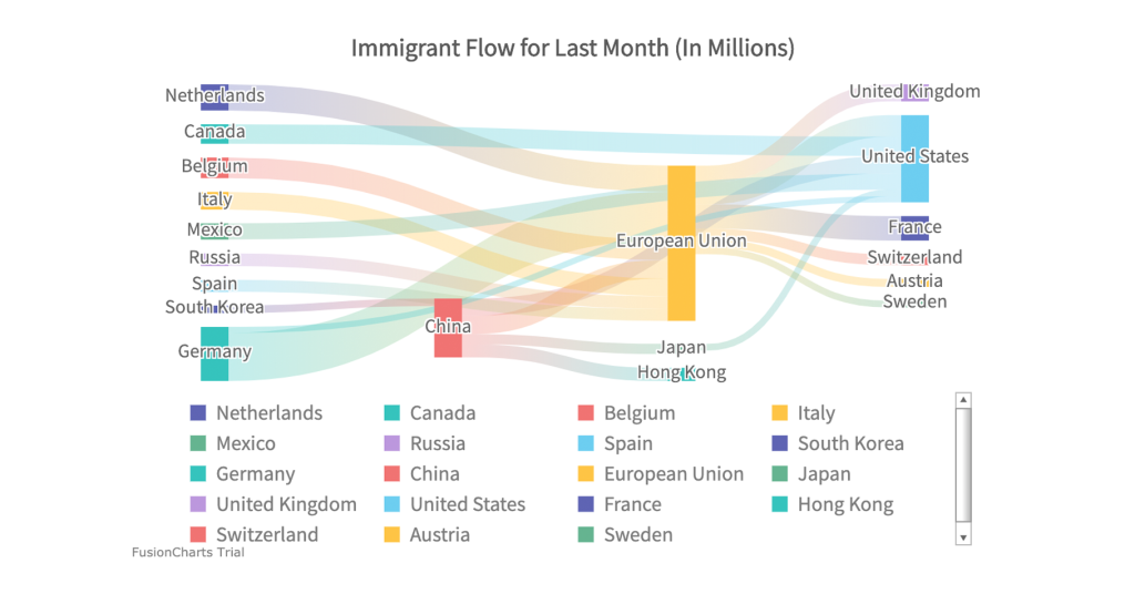
A Sankey chart is a specialized type of diagram used to visualize the flow of resources, energy, or values between different entities or categories. It consists of nodes (representing entities or categories) connected by arrows or flows. The width of the arrows corresponds to the quantity of the flow, making it easy to grasp the relative proportions and connections within the system.
Sankey charts are effective for showcasing how resources or values are distributed, transferred, or transformed within a process. They are particularly useful when you want to illustrate the allocation of resources, the breakdown of expenses, or the movement of users through a website.
When to Use Sankey Charts
Sankey charts are ideal for situations where you need to:
- Analyze and visualize the distribution of resources, such as energy, materials, or funds.
- Explore the connections between different stages in a process or system.
- Illustrate how inputs are transformed into outputs.
- Emphasize the proportionality of flows within a system.
They are commonly used in various fields, including energy management, environmental analysis, marketing, and financial planning.
Key Features to Look For
When choosing a Sankey chart maker, consider the following key features:
Customization Options
Look for a tool that offers a high degree of customization. This includes the ability to adjust colors, fonts, labels, and layout to match your specific visualization needs. The more control you have over the appearance of your Sankey chart, the better you can tailor it to your audience.
Data Import and Integration
A robust Sankey chart maker should allow you to easily import data from various sources, such as spreadsheets or databases. It should also offer integration with popular data analysis and visualization platforms, enabling seamless data flow and updates.
Interactivity and User Experience
Interactivity enhances the effectiveness of your Sankey chart. Look for features like tooltips, zooming, and filtering options that allow users to explore the data in detail. A user-friendly interface and responsive design are also essential for a positive user experience.
Top Sankey Chart Makers
Now, let’s explore some of the top Sankey chart-maker tools available:
1. Tableau
Tableau is a powerful data visualization tool that includes Sankey chart capabilities. It offers a user-friendly interface and a wide range of customization options. Tableau also provides data connectivity to various sources, making it a versatile choice for creating dynamic Sankey charts.
2. Plotly
Plotly is known for its interactive charting capabilities, and it offers a straightforward way to create Sankey charts. With Plotly, you can create web-based, interactive Sankey visualizations that can be easily embedded into websites or reports.
3. Microsoft Power BI
Microsoft Power BI is a popular business intelligence tool that supports Sankey charts. It offers a drag-and-drop interface for creating Sankey diagrams and provides seamless integration with Microsoft Excel and other data sources.
4. Google Charts
Google Charts is a free and user-friendly tool that allows you to create basic Sankey charts. While it may not offer the same level of customization as some other tools, it’s an excellent choice for simple, straightforward visualizations.
5. D3.js
D3.js is a JavaScript library for creating custom data visualizations, including Sankey charts. While it requires coding skills, it provides the utmost flexibility and control over your visualizations. D3.js is favored by developers and data enthusiasts who want to create highly customized Sankey charts.
Comparing the Best Chart Makers
To help you make an informed choice, let’s compare these Sankey chart-maker tools based on features, and pricing.
Features Comparison
Here’s a summary of key features offered by each Sankey chart maker:
| Feature | Tableau | Plotly | Microsoft Power BI | Google Charts | D3.js |
|---|---|---|---|---|---|
| Customization Options | High | Moderate | High | Limited | Customizable |
| Data Import and Integration | Yes | Yes | Yes | Limited | Yes |
| Interactivity and User Experience | Yes | Yes | Yes | Limited | Yes |
Pricing Comparison
Pricing varies widely among these tools, from free options to paid subscriptions. Here’s a general overview:
| Tool | Free Plan | Starting Price for Paid Plan |
|---|---|---|
| Tableau | No | Varies based on licensing |
| Plotly | Yes | $540/year |
| Microsoft Power BI | Yes | $9.99/user/month |
| Google Charts | Yes | Free |
| D3.js | Yes | Free (open source) |
How to Create a Sankey Chart
Creating a Sankey chart typically involves the following steps:
- Data Preparation: Organize your data in a format that suits your chosen Sankey chart maker. Ensure it includes the necessary columns and values to define the flows between nodes.
- Select a Tool: Choose a Sankey chart maker based on your specific requirements, such as customization, interactivity, and data integration capabilities.
- Import Data: Import your prepared data into the selected tool. Most tools allow you to import data from various sources, including spreadsheets and databases.
- Design Your Chart: Use the tool’s interface to design your Sankey chart. Customize the appearance, labels, and interactions as needed.
- Interactivity: Enhance your Sankey chart with interactive features, such as tooltips and filters, to make it more engaging and informative.
- Save and Share: Once your Sankey chart is ready, save it in your preferred format, such as an image or interactive web visualization. Share it with your target audience through reports, websites, or presentations.
Real-World Use Cases
Sankey charts find applications in a wide range of industries and scenarios. Here are a few real-world use cases to illustrate their versatility:
I. Sustainability and Energy Management
Organizations use Sankey charts to visualize energy flows, identify inefficiencies, and make informed decisions about resource allocation. For example, a manufacturing facility can use a Sankey chart to track the energy sources and consumption throughout its production process, helping to optimize energy usage and reduce costs.
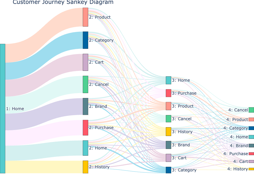
II. Marketing and User Behavior Analysis
Marketers leverage Sankey charts to map out user journeys and conversion funnels. By visualizing how users navigate websites or mobile apps, marketers can identify drop-off points and optimize the user experience. This can lead to increased conversions and customer satisfaction.
III. Financial Planning and Budgeting
Financial analysts and planners use Sankey charts to illustrate budget allocations, showing how funds are distributed across departments, projects, or expense categories. This visual representation helps stakeholders understand financial priorities and make informed decisions.
Conclusion
In conclusion, choosing the best Sankey chart maker depends on your specific needs and preferences. Whether you prioritize ease of use, customization, or interactivity, there’s a tool that can meet your requirements. By understanding the power of Sankey charts and selecting the right tool, you can unlock the potential to visualize complex data relationships and convey meaningful insights.
Now that you’re equipped with the knowledge to create compelling Sankey charts, you can embark on your data visualization journey with confidence. Visualize your data, tell compelling stories, and empower better decision-making through the art of Sankey charting.


