
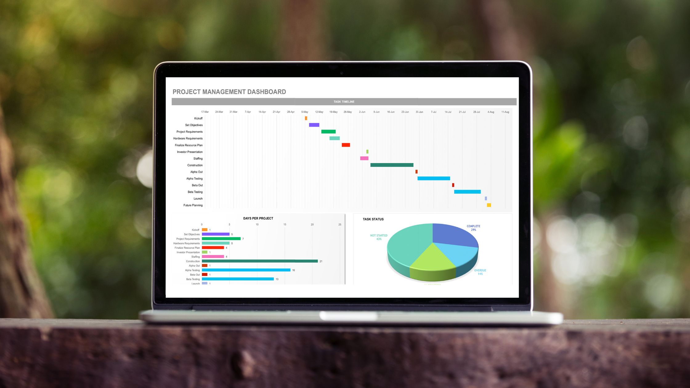
Hey there! Ever found yourself drowning in data on Google Sheets and thought, “I wish I could visualize this!”? Well, guess what? You can! And
Category: Charts

Google Sheets, a powerful spreadsheet program from Google’s suite of office tools, provides users with a wide range of capabilities – from simple data entry
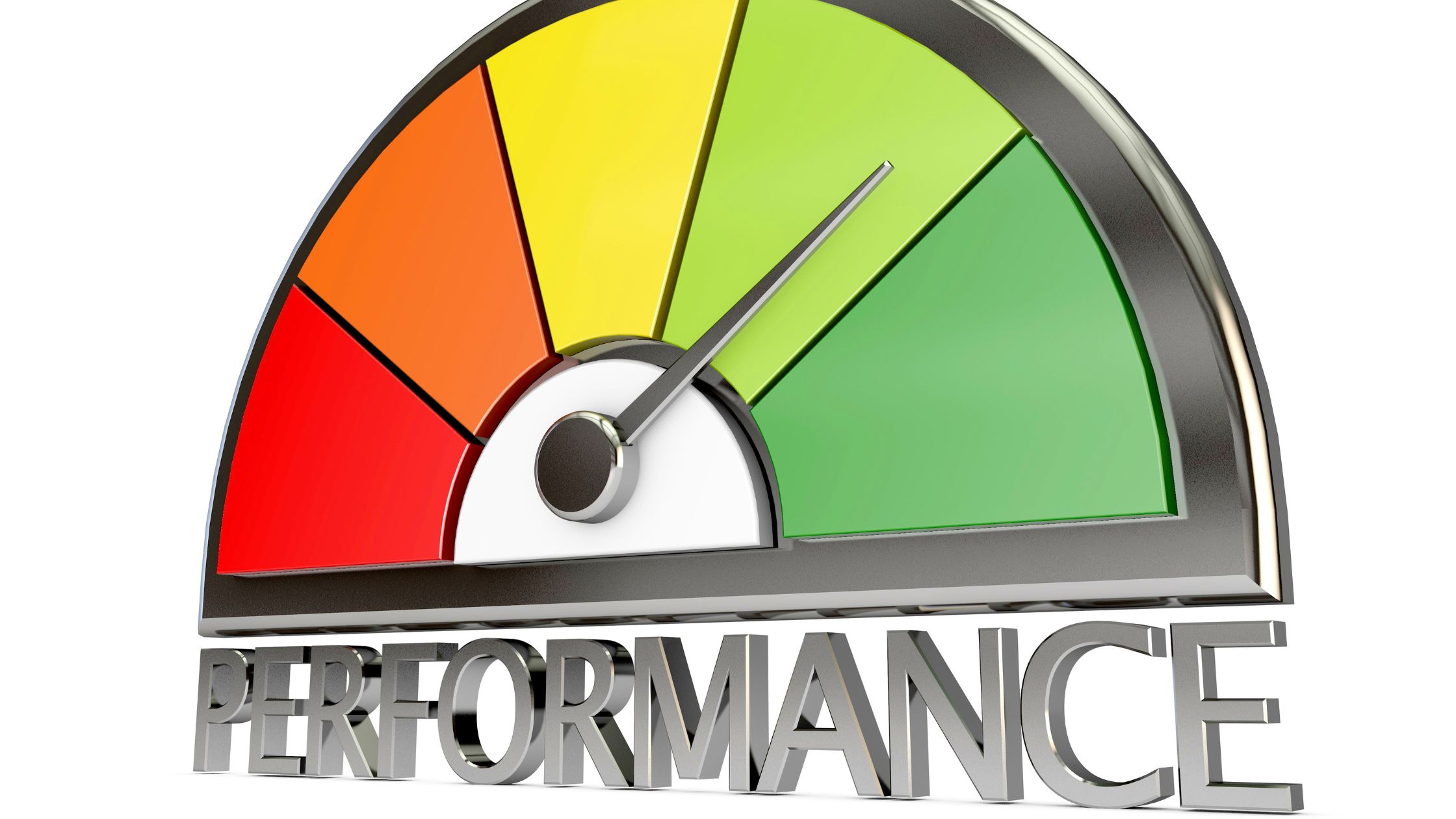
In today’s dynamic work environment, measuring and enhancing employee performance is not just beneficial—it’s essential for the growth and success of organizations. One powerful tool
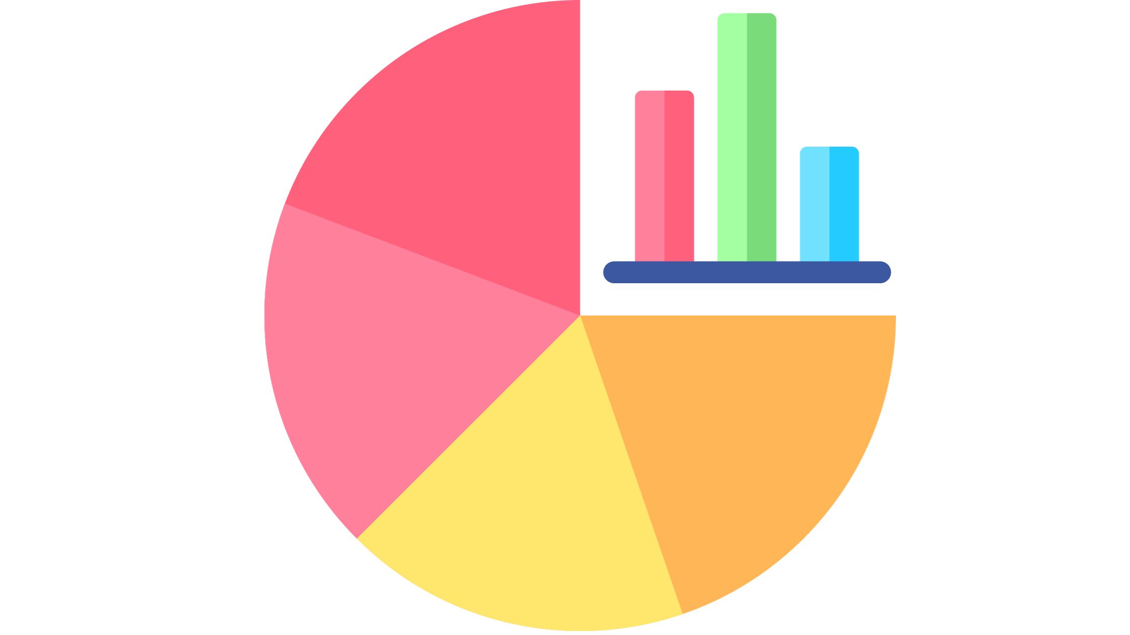
Data visualization is an indispensable tool in the modern age of information overload. Among the array of visualization types, the radial bar chart emerges as
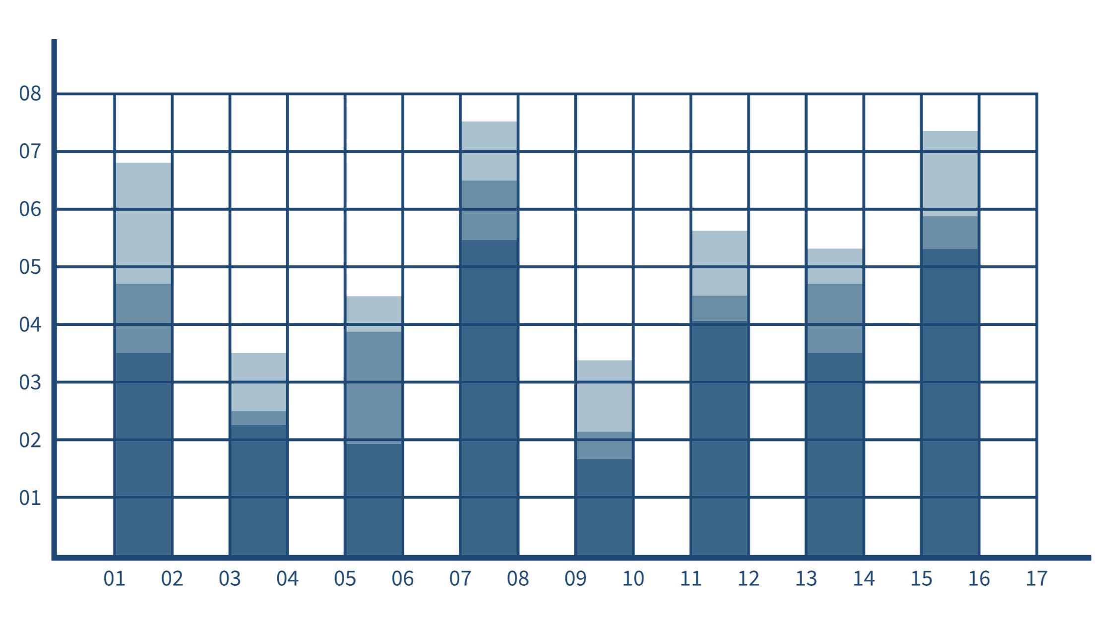
In the ever-expanding landscape of data visualization, the stacked column chart stands tall as a versatile and dynamic tool. When the need arises to compare
Time series graphs are indispensable tools for visualizing data that evolves over time. From financial trends to climate patterns, they provide valuable insights into historical

A double Y-axis graph, also known as a dual-axis or twin-axis chart, is a valuable visualization technique for comparing two sets of data with different
Energy flow diagrams are powerful visual tools that help us comprehend how energy moves within a system or process. In this comprehensive guide, we’ll explore
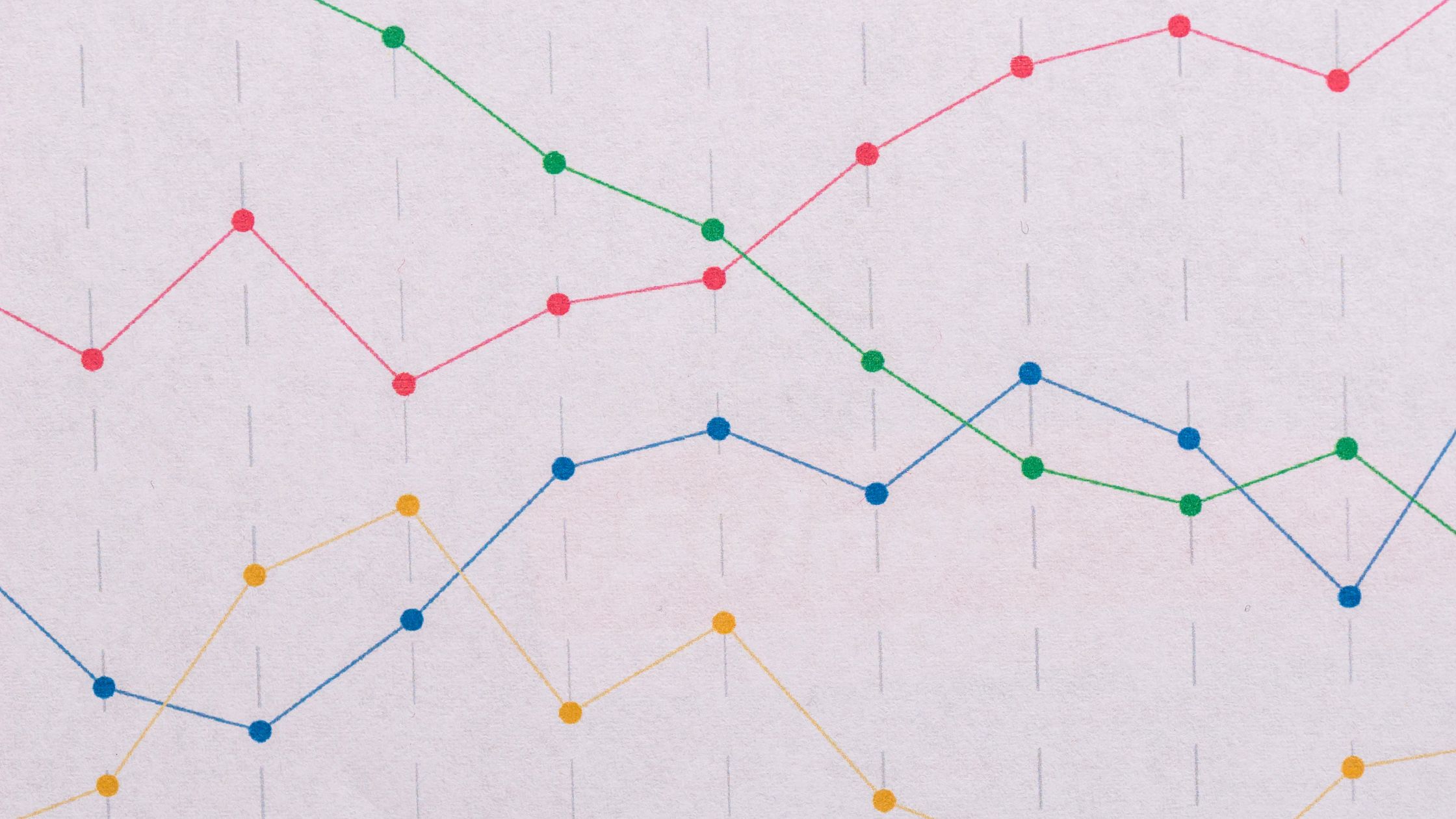
Visual representation is the key to understanding data effectively. When it comes to plotting data points, two common choices are scatter plots and line graphs.

Would you like to utilize Excel for free online? You do, of course! This article will outline all the completely genuine and authorized ways you