
Sankey diagrams are valuable tools for visualizing the flow of resources, energy, or values between different entities or categories. While creating Sankey diagrams traditionally required
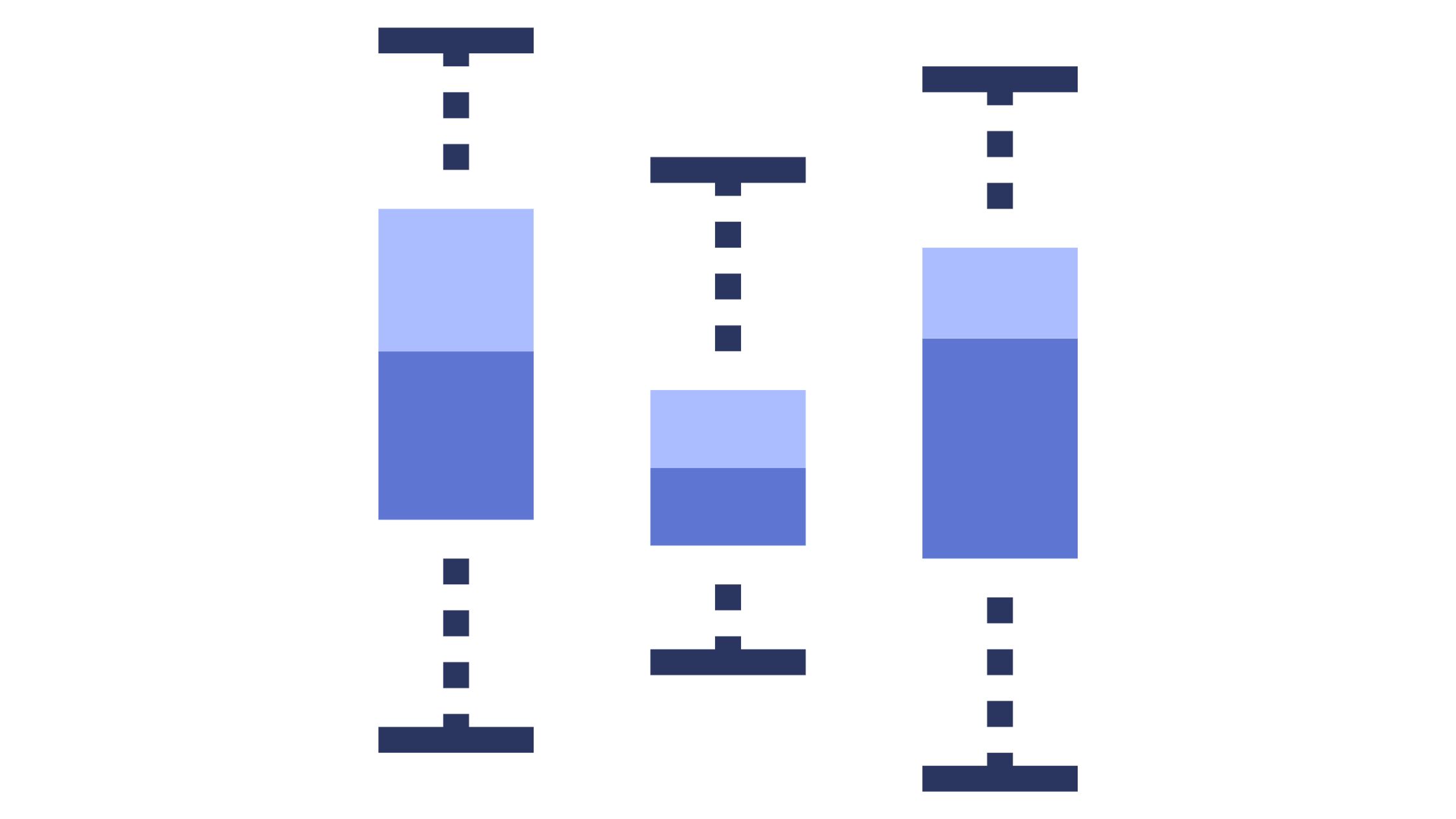
A Box and Whisker plot, also known as a box plot, is a powerful graphical tool for summarizing and visualizing data distributions. They provide a

In the world of data visualization, the Sankey chart has emerged as a powerful tool for conveying complex relationships and flows between different elements. Whether

Hey there! Ever found yourself drowning in data on Google Sheets and thought, “I wish I could visualize this!”? Well, guess what? You can! And

Google Sheets, a powerful spreadsheet program from Google’s suite of office tools, provides users with a wide range of capabilities – from simple data entry

In today’s dynamic work environment, measuring and enhancing employee performance is not just beneficial—it’s essential for the growth and success of organizations. One powerful tool
Data visualization is an indispensable tool in the modern age of information overload. Among the array of visualization types, the radial bar chart emerges as
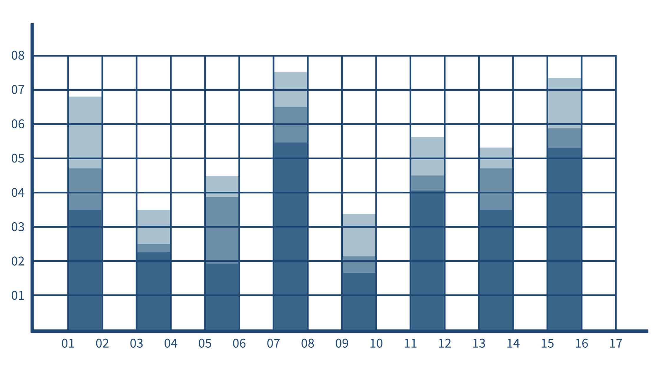
In the ever-expanding landscape of data visualization, the stacked column chart stands tall as a versatile and dynamic tool. When the need arises to compare

Surveys provide invaluable first-hand data on customer opinions. But raw survey results alone don’t tell the full story. Proper analysis and an insightful presentation transform
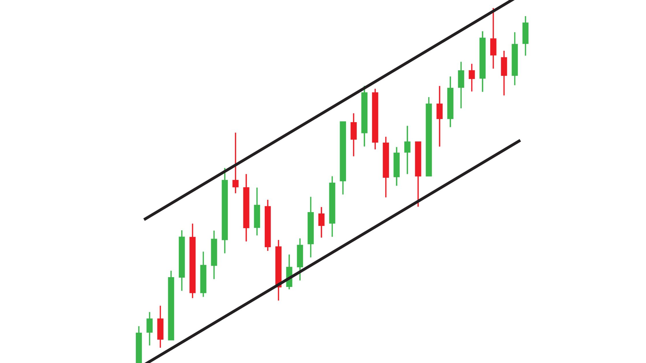
Time series graphs are indispensable tools for visualizing data that evolves over time. From financial trends to climate patterns, they provide valuable insights into historical