
Turning complex datasets into clear and actionable insights is no easy feat. But armed with the right types of data visualization charts, you can unearth

NPS (Net Promoter Score) is a powerful metric used by businesses to measure customer loyalty and satisfaction. It provides valuable insights into how likely your

The PESO model is a modern framework designed to help organizations create a well-rounded communication strategy that leverages multiple channels and touchpoints to reach their
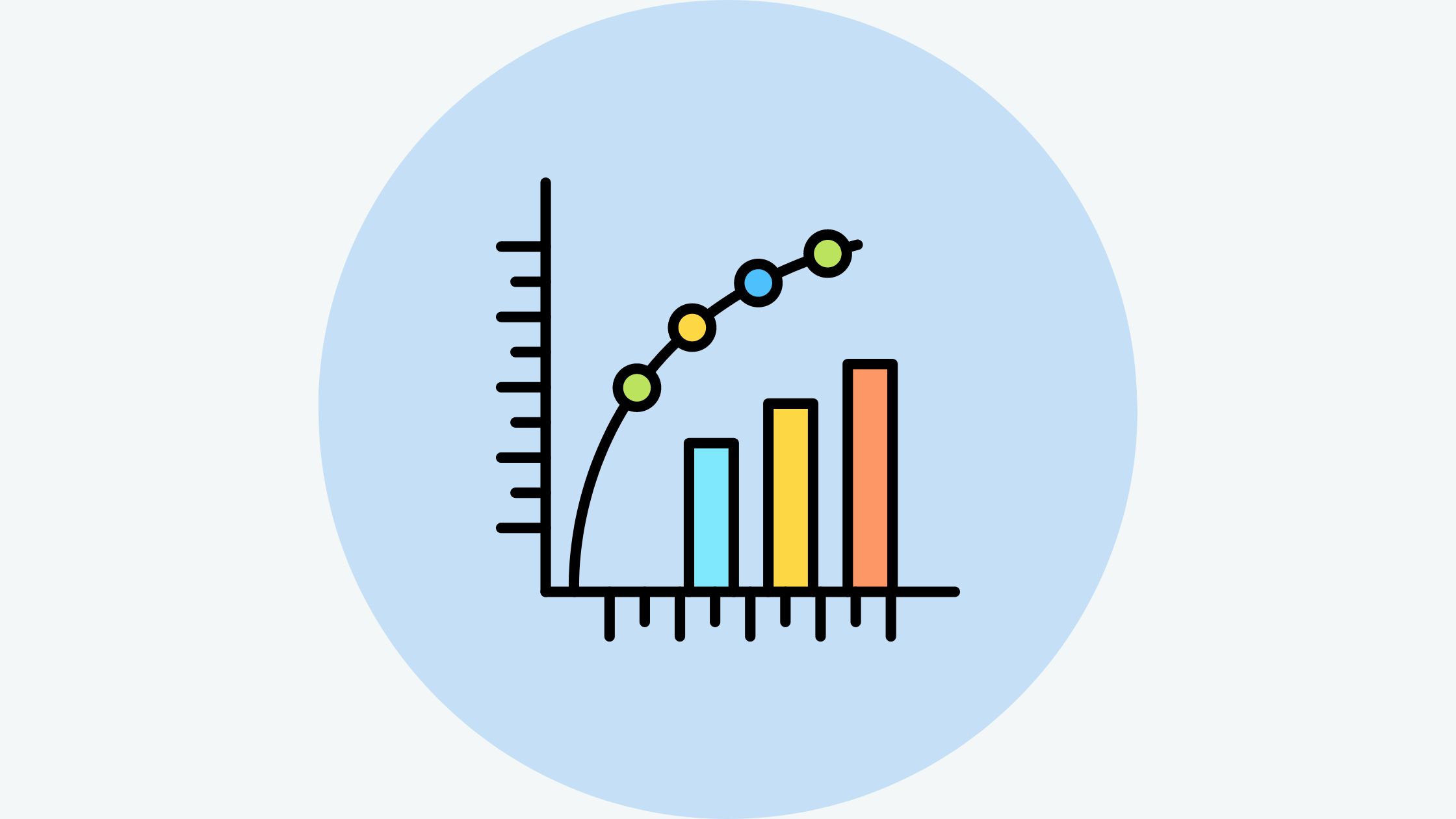
Data visualization plays a pivotal role in understanding complex information. Among the various tools at our disposal, the Pareto chart stands out as a powerful
Ever wondered how companies visually represent their organizational hierarchies? Or how family trees neatly map out complex ancestral relationships? There’s a special structure that makes

As an experienced affiliate marketer, I often get asked whether it is possible to do affiliate marketing with Google Ads. Many assume it is against

Guerilla marketing examples are a great way to understand this unconventional and disruptive marketing tactic and can inspire you to create one for your brand.

With the explosion of big data across all industries, the ability to visualize information in creative and meaningful ways has become more important than ever.

Monitoring and tracking student performance and progress is an essential part of teaching and education. Knowing where students excel and where they struggle allows teachers

Sales data analysis examples provide real-world frameworks for extracting powerful insights from CRM data to boost revenue. Sales leaders rely on this in-depth analysis of