
While I was conducting research for my thesis, I often wondered about the best way to present survey results. Conducting surveys is a powerful tool

In the world of marketing, both the 4 Ps and the 7 Ps are essential frameworks used by businesses to design and implement effective marketing

Interested in the Sankey diagram for visualizing your customer journey? Understanding the customer journey is crucial for businesses seeking to enhance customer experiences, optimize marketing

A comparison chart, also known as a bar chart or column chart, is an effective way to visually compare data points. Google Sheets offers a
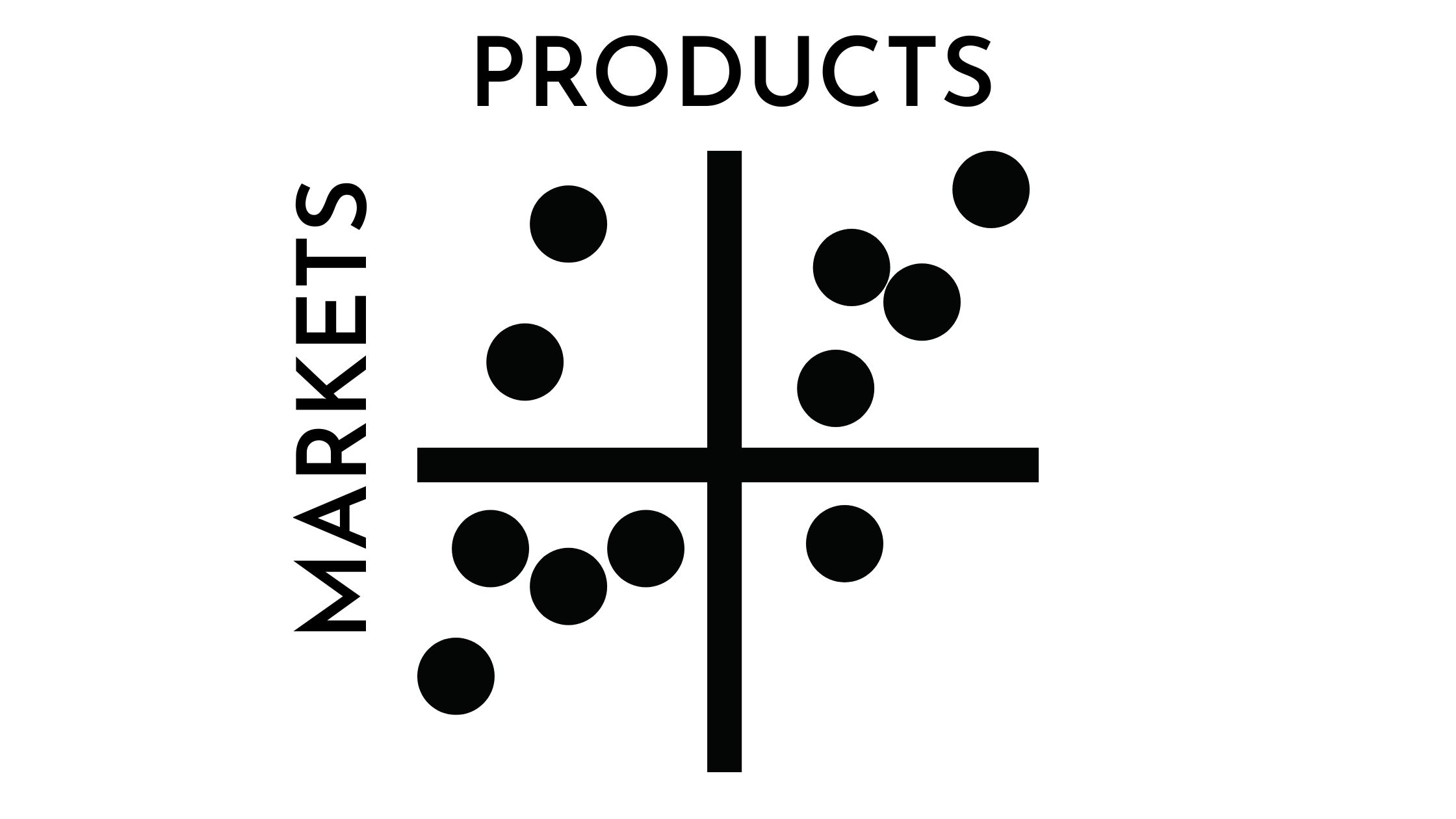
The Ansoff Matrix, developed by Igor Ansoff in 1957, is a strategic planning tool that helps businesses explore growth opportunities. It provides a framework for

Discovering unique ways to increase sales is crucial for businesses aiming to thrive and excel in today’s competitive markets. While traditional sales techniques are effective,

Are you looking for ways to analyze Likert scale data but don’t know how? A Likert scale is a survey tool that measures people’s attitudes

In the dynamic world of data analysis, harnessing the potential of visual representation has become paramount for businesses seeking a competitive edge. Excel, the versatile

Are you looking for effective marketing strategies to boost your business? Look no further than STP marketing examples! Segmentation, targeting, and positioning (STP) is a

Presenting survey data effectively is crucial for researchers and professionals alike. Among the many tools available, the Likert Scale is a popular and widely used