
Looking for a font in Microsoft Word that resembles handwriting? Explore options that add a personal touch and charm to your documents.
Yearning for insight into the myriad uses of Microsoft Word?

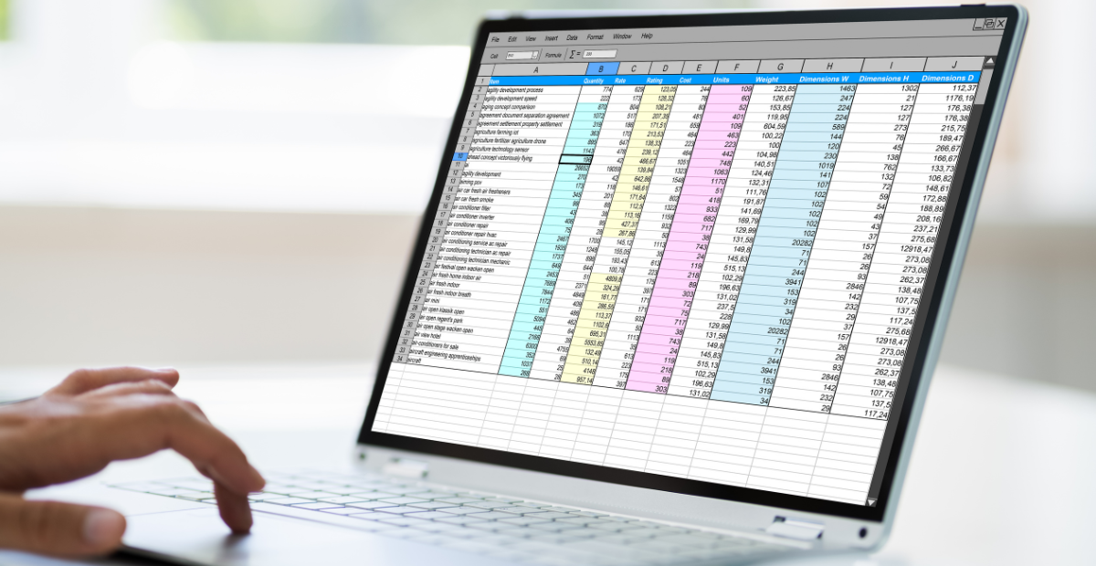
Mystified by Excel? Uncover its hidden powers and discover how it can transform your data handling skills.
Tackle complex calculations and streamline your data analysis with array Excel functions – discover the power of array formulas in Excel.

Caught in the dark mode dilemma on Microsoft Word? Find out how to effortlessly switch to light mode and enhance your online writing experience.

Learn how to transform your Excel data from columns to rows with simple yet powerful techniques, and unlock the potential of your spreadsheet.
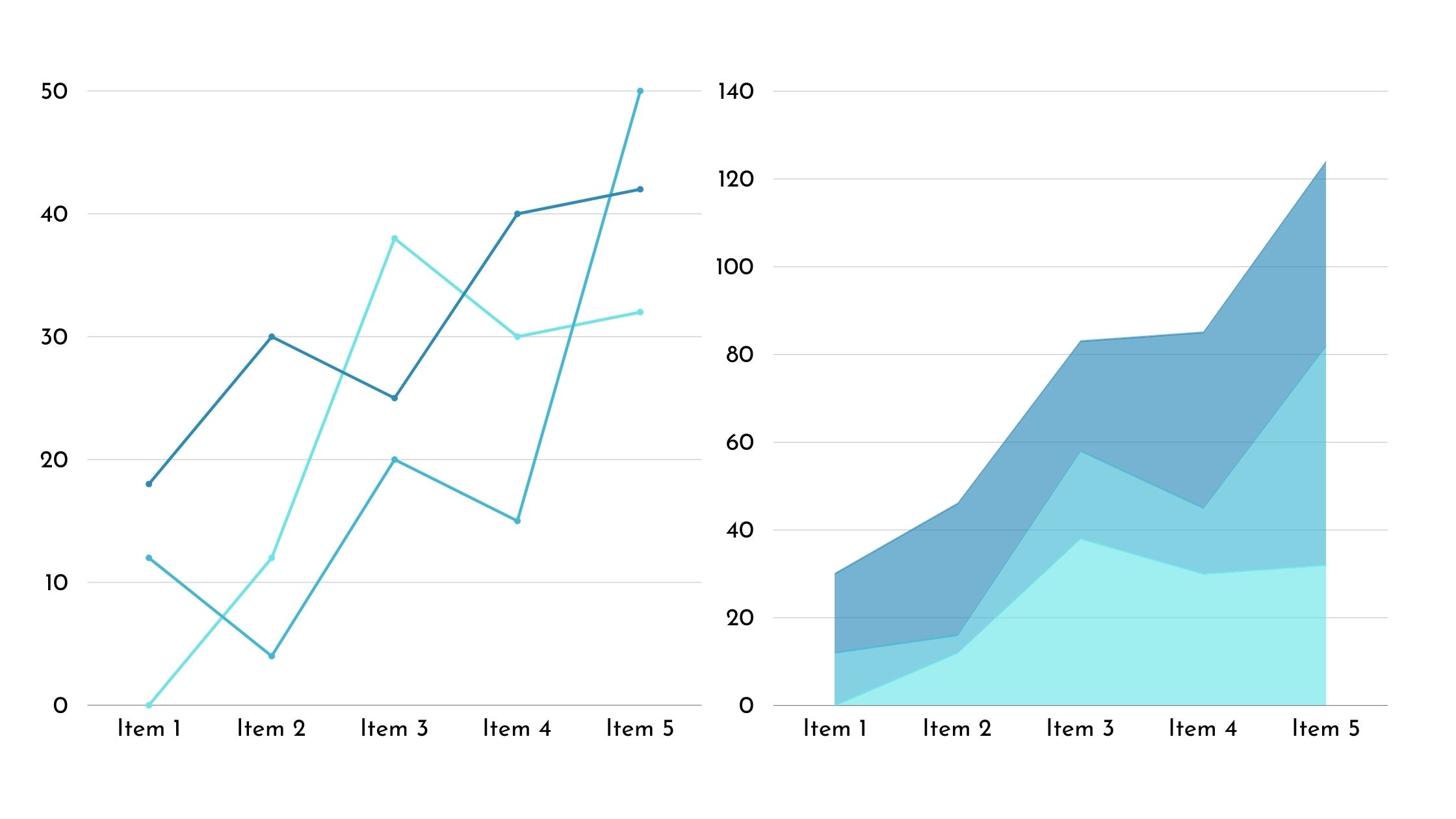
Discover how charts in Excel can transform raw data into clear, insightful visuals that uncover patterns and relationships, revolutionizing your data analysis process.

Get ready to revolutionize your Excel experience with macros in an online editor – discover the game-changing benefits awaiting you.

Microsoft Excel provides a robust set of charting capabilities to visualize data trends, compare metrics, and communicate insights through graphical representations. If we divide them

Packed with easy and free solutions, discover how to edit Word documents online without signing up, making your life a whole lot easier.