
So, you think you’re fancy with your Word and your Excel spreadsheets, huh? Well, let me tell you, there’s a whole world of online tools

Mobile apps have become essential tools for running a successful business in today’s digital landscape. They can boost productivity, streamline communication, and help manage finances.

The IF function is one of the most useful and frequently used functions in Excel. It allows you to make logical comparisons between values and

Want to visualize your data in a way that’s both informative and visually appealing? Look no further than the double bar graph! By combining two

Are you tired of feeling like you have no control over external factors? Don’t worry, because the control chart is here to help you. Think

Do you ever feel like the internet is a vast and closed-off world, restricting your access to information and entertainment? Well, fear not, because VPN
Are you tired of feeling overwhelmed by a large amount of data? Take advantage of clustered column charts to bring clarity to your information! This

Unlock the power of data visualization with the versatile clustered bar chart! This chart brings together multiple bars, each representing different categories, to provide a
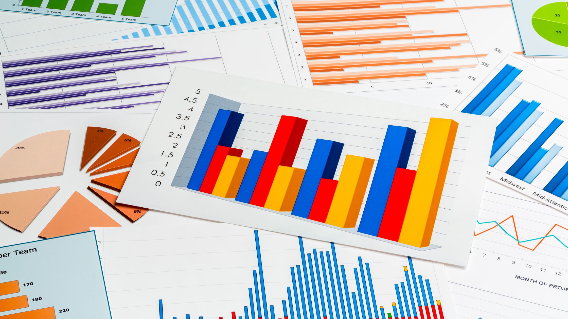
With data volumes multiplying exponentially across industries, effective visualization for accelerated insights is pivotal. While stalwart charts like bar graphs and pie charts dominate dashboards,

A comparison bar chart, often referred to simply as a bar chart or bar graph, is a graphical representation of data that uses rectangular bars