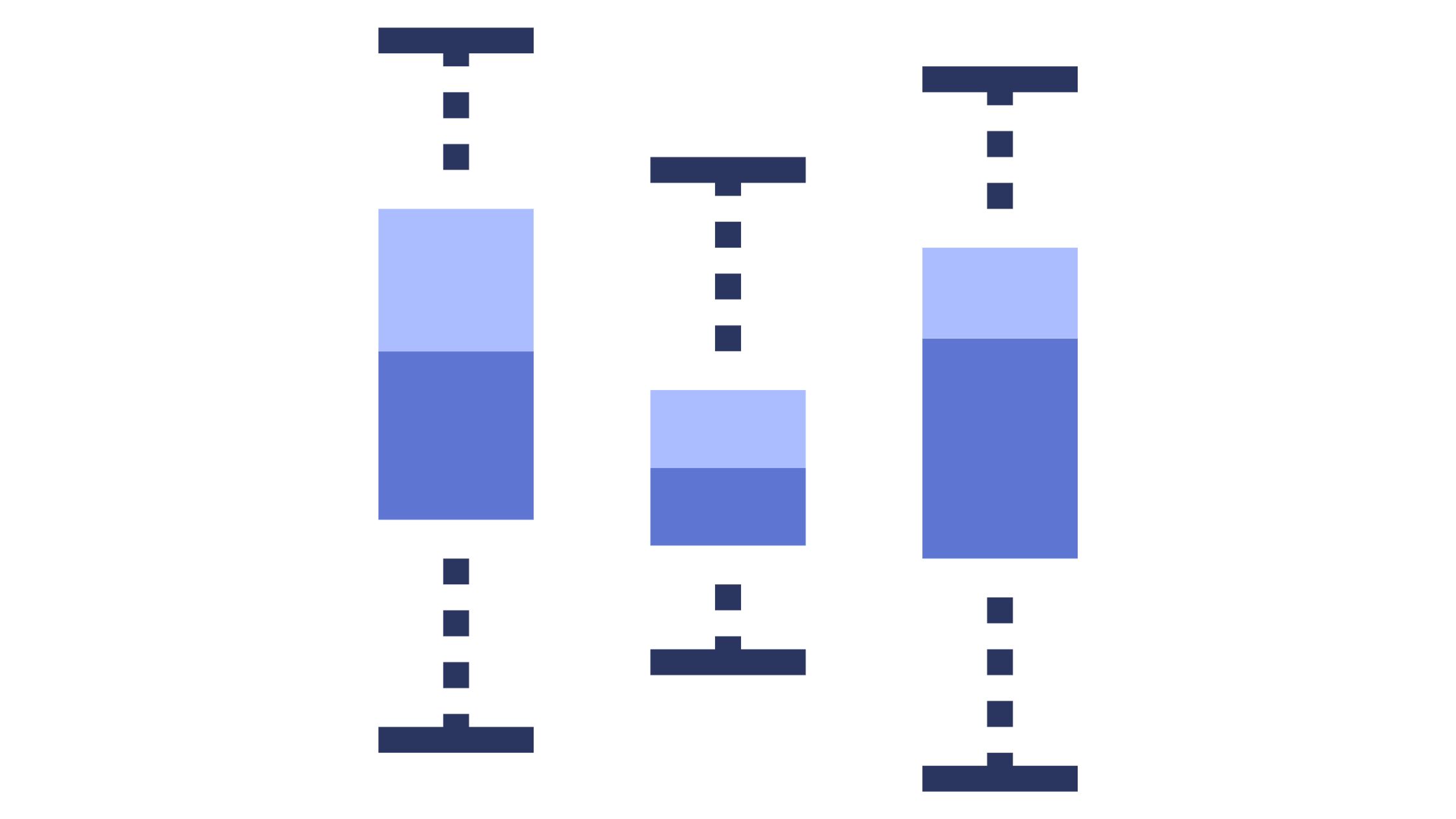
A Box and Whisker plot, also known as a box plot, is a powerful graphical tool for summarizing and visualizing data distributions. They provide a clear and concise way to display the spread and central tendency of a dataset, making them invaluable in statistics and data analysis. In this article, we’ll learn about box and whisker plots, explaining what they are, how to interpret them, and, most importantly, how to create one step by step.
Introduction to Box and Whisker Plots
What is a Box and Whisker Plot?
A box and whisker plot is a graphical representation of a dataset’s distribution. It displays key statistical information in a compact form, allowing you to quickly understand the central tendency, spread, and presence of outliers within the data.
A typical box plot consists of a rectangular “box” and two “whiskers” extending from it. The box is divided into two parts by a vertical line, representing the median. The lower and upper edges of the box mark the first and third quartiles, respectively. The whiskers extend from the quartiles to the minimum and maximum data values within a specified range.
Why Use Box Plots?
Box and whisker plots are used for various purposes, including:
- Comparing Distributions: You can easily compare the distributions of multiple datasets using box plots, making them useful for identifying differences and similarities.
- Detecting Outliers: Box plots provide a visual way to identify potential outliers in your data, helping you investigate anomalies.
- Summarizing Data: They succinctly summarize the central tendency, spread, and variability of a dataset without the need for complex statistical calculations.
Key Components of a Box and Whisker Plot
To fully understand a box and whisker plot, let’s break down its key components:
1. The Box
- Median (Q2): The vertical line inside the box represents the median, which is the middle value when the data is sorted. It splits the data into two halves, with 50% of the values falling below it and 50% above it.
- First Quartile (Q1): The lower edge of the box marks the first quartile, representing the 25th percentile. It indicates that 25% of the data falls below this value.
- Third Quartile (Q3): The upper edge of the box marks the third quartile, representing the 75th percentile. It indicates that 75% of the data falls below this value.
2. The Whiskers
- Minimum and Maximum: The whiskers extend from the quartiles to the minimum and maximum data values within a specified range. Outliers, if present, are often displayed as individual points beyond the whiskers.

3. Outliers
- Outliers: Outliers are data points that significantly deviate from the overall distribution. They are typically displayed as individual points outside the whiskers and can be indicative of data anomalies or errors.
Interpreting a Box and Whisker Plot
When you encounter a box and whisker plot, you can glean valuable insights about the dataset:
Median and Quartiles
- The median (Q2) indicates the center of the data distribution.
- The first quartile (Q1) and third quartile (Q3) provide information about the spread of the middle 50% of the data.
- The interquartile range (IQR), calculated as Q3 – Q1, quantifies the spread of the central 50% of the data.
Spread of Data
- The length of the box represents the IQR, showcasing the variability of the central data.
- The whiskers give an idea of the overall range of the data within a specified range.
Outlier Detection
- Outliers, displayed as individual data points outside the whiskers, can be easily identified.
- They may require further investigation to determine if they are valid data points or errors.
Creating a Box and Whisker Plot
Now, let’s explore how to create a box and whisker plot step by step:
1. Organize Your Data
- Collect and organize the data you want to visualize.
- Ensure your data is numerical, as box plots are primarily used for quantitative data.
2. Calculate Quartiles
- Calculate the median (Q2), first quartile (Q1), and third quartile (Q3) of your dataset.
- Determine the interquartile range (IQR) by subtracting Q1 from Q3.
3. Draw the Box and Whiskers
- Draw a number line and label it with the minimum, Q1, median, Q3, and maximum values.
- Draw a box from Q1 to Q3, indicating the IQR.
- Extend whiskers from the box to the minimum and maximum values within a specified range.
- Add individual data points as outliers if they fall outside the whiskers.

4. Identify and Mark Outliers
- Examine the data points beyond the whiskers to identify outliers.
- Mark outliers as individual points outside the whiskers.
Real-World Applications
Box and whisker plots find applications in various fields:
I. Education and Test Scores
Educators and researchers use box plots to visualize and compare test scores among students or schools. They provide insights into the distribution of scores and help identify potential areas for improvement.
II. Financial Analysis
In finance, box plots are employed to analyze the distribution of financial data, such as stock returns or asset prices. They assist in understanding the volatility and spread of financial metrics.
III. Healthcare and Medical Data
Medical professionals use box plots to examine patient data, such as blood pressure readings or cholesterol levels. They aid in identifying outliers that may indicate health concerns.
Conclusion
In conclusion, box and whisker plots are invaluable tools for summarizing, visualizing, and comparing data distributions. They offer a concise way to understand central tendencies, spread, and outlier presence within a dataset. By mastering the creation and interpretation of box plots, you can enhance your data analysis and decision-making skills.
Now that you’ve gained a comprehensive understanding of box and whisker plots, consider incorporating them into your data analysis toolbox. Whether you’re a student, researcher, or data analyst, these visualizations can illuminate insights and patterns hidden within your data.
FAQs
Use a box and whisker plot when you want to visualize and compare the distribution of a dataset, identify outliers, and summarize key statistical information.
Data points outside the whiskers of a box plot are typically considered outliers. However, the definition of an outlier can vary depending on the context and specific criteria.
Yes, popular data analysis software, such as Excel, R, Python (with libraries like Matplotlib and Seaborn), and statistical tools like SPSS, offer the capability to create box and whisker plots.
Yes, there are variations, such as notched box plots and violin plots, that provide additional information about the distribution and spread of data. These variations can be useful in specific analytical contexts.


