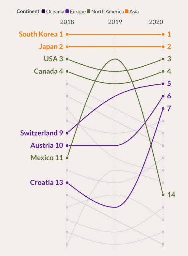
With data volumes multiplying exponentially across industries, effective visualization for accelerated insights is pivotal. While stalwart charts like bar graphs and pie charts dominate dashboards, less mainstream options like slope charts unlock unique analytical superpowers.
This comprehensive guide will explore what is a slope chart, why it matters, use cases, and a practical step-by-step walkthrough for constructing slope charts in Excel.
What is a Slope Chart?
A Slope Chart, also known as a slope graph or Tufte’s slope graph visualizes relative changes between discrete data points for one or more subjects across contiguous periods. It was first presented by Edward Tufte in his book The Visual Display of Quantitative Information It plots data series as sloped lines joining values chronologically.
The steepness of slopes indicates the rate of change while slope direction signals whether values increased or decreased. Slope charts spotlight rapid shifts lost in absolute aggregated metrics.
For example, a slope chart can showcase person A’s fluctuating weight over 3 months using rising and falling diagonal lines rather than actual pound values. The visual thrust magnifies variance.
Key Characteristics of Slope Charts
Data Series – Values plotted over time for one or more subjects
Time Scale – Continuous equal units like months or years
Sloped Lines – Angled diagonals joining sequential data points
Slope Steepness – Signals rate of change between values
Slope Direction – The upward slope shows gain over time, and the downward slope means a decrease
Zero Baseline – Lines anchor to zero on Y-axis underscoring relativity

These core constituents set slope charts apart underlining variability over pure value reporting.
Why Use Slope Charts?
Slope charts are a powerful analytical tool for several reasons:
1. Highlighting Relative Changes
They bring the focus to the significance of relative changes between time periods, not just the absolute figures. This makes it easier to spot the pace of change.
2. Clarifying Trends
Slope charts provide a clear, visual representation of trends, indicating whether values are rising or falling, and at what rate, facilitating quick and intuitive understanding.
3. Condensing Complex Data
They allow for multiple data series to be displayed together compactly, making it easier to compare and contrast trends across different subjects.
4. Detailed Insights from Frequent Data
For dense datasets with frequent measurements, such as daily metrics, slope charts can offer clearer insights by highlighting the overall direction and rate of change, which might be lost in a cluttered line graph.
Slope charts excel in rapidly changing settings, drawing attention to subtle but important trends, which is crucial for maintaining agility.
Also Read: CSAT Score Bar Chart
Step-by-Step Guide to Making a Slope Chart in Excel
Here’s a step-by-step guide to creating a slope chart in Excel:
- Open Excel and Input Data: Enter your structured data into an Excel worksheet.
- Calculate Slopes: In an adjacent column, calculate the slopes for each category using a simple formula (change in value/change in time).
- Create a Scatter Plot: Select your data, including categories and slopes, and go to the “Insert” tab. Choose “Scatter” and then “Scatter with Straight Lines.”
- Format the Chart: Customize your chart by adding data labels, and titles, and adjusting the axes as needed.
- Adjust Line Colors and Styles: Differentiate lines for each category by adjusting colors and line styles.
- Fine-Tune Labels: Ensure data labels are clear and positioned appropriately to enhance readability.
Interpreting Slope Chart Results
Interpreting slope charts involves analyzing the direction and steepness of lines:
- Upward Slope: Indicates an increase in value over time.
- Downward Slope: Suggests a decrease in value over time.
- Horizontal Line: This represents no change between the two-time points.
- Steep Slope: This signifies a rapid change, while a gentle slope implies a gradual change.
Practical Use Cases for Slope Charts
Slope charts best serve analytics needs involving:
- Growth trend diagnosis – New user acquisition rates
- Production tracking – Manufacturing unit hourly output steady
- Resource planning – Forecasting staffing needs from project timeline demands
- Performance management – Comparing sales reps annual deals closure velocities
- Predictive modeling – Anticipating server loads from traffic climb trajectories
- Operational monitoring – Call center ticket resolutions responsiveness by week
- Campaign success measurement – App rating upward mobility post-update
For time-series data applications needing sharper insights into emerging shifts as the basis for decisions, strategically adopt slope charts over regular graphs.

FAQs About Slope Charts
When should I Avoid using slope charts?
Avoid slope charts for static data or chronologies with irregular gaps. Use simple bar charts instead for non-contiguous data. Slope lines get confusing if time increments vary.
Can I show precise values with slope visuals?
Yes, enabling data labels displays exact numbers along slope chart lines without compromising relativity. Just toggle the data labels field to overlay values across charted lines.
What Excel chart type should I leverage to plot slope graphs?
Use Excel scatter plots with trendlines and delete actual scatter points. The angled regression trendline cleanly conveys linear slopes ideal for slope chart intent.
How do I display acceleration on my slope chart?
To highlight changes in rate shifts, add a secondary delta-based slope chart. For example, plot website visitor growth on primary and weekly additions on secondary charts. Use contrasting color schemes to distinguish velocity among growth charts.
Can I create slope charts in tools besides Excel?
Yes, other software offering time-series graphing like MATLAB, D3.js etc can be configured into slope visuals through trendline settings and axis adjustments. Spreadsheets remain most convenient for everyday business usage but technical apps add more formatting options.
Conclusion
Slope charts are powerful tools for visualizing trends and changes in data over time. By following the steps outlined in this guide and applying best practices, you can create informative and visually appealing slope charts in Excel. Whether you’re analyzing business performance, market trends, or any other data-driven insights, slope charts offer a concise and effective way to communicate your findings with precision.


